
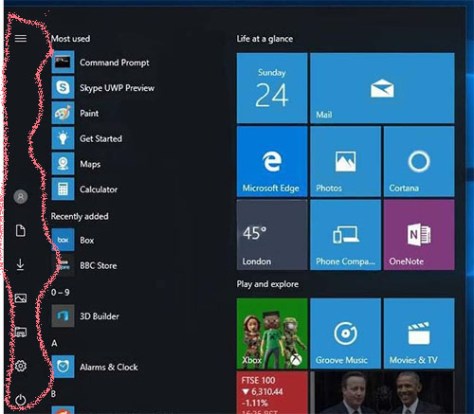
Curmudgeonly old git wot I am – the WIN10 preview start menu build seems fantastically cluttered with the addition of a ‘rail’ down the far-left edge.
(I’ve thoughtfully marked it in the pic -with a lovely wiggly line).
Not sure – in the longer run if MS’s and Google march toward ubiquitous icon markings (EVERYONE knows what these icons mean – don’t they . . . I mean, DON’T THEY?) – no, really NO, they don’t. This is singularly inaccessible to most except frequent and constant users.
